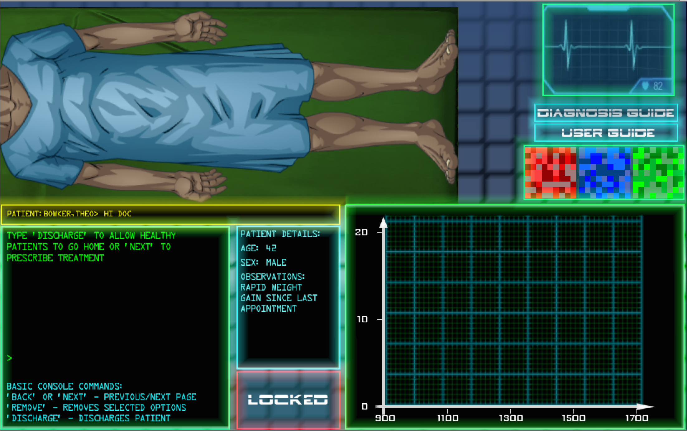
SORS dev log part 1 - Life's easier when you KISS

‘A trip to the doctor's...’
This is the first in a series of posts in which we ‘celebrate’ the release of our first game demo, SORS, by discussing its design and development. You can play a demo of SORS here.
There’s an acronym they use in the army (I’m aware of it from my hardened days in the school cadet force, and when I say hardened, I mean I was a pretty fat teenager in a uniform). It’s known as KISS, and stands for Keep It Simple, Stupid.
How apt this is for game design! When I started designing SORS (in my head) I had a grand picture of how the game would work. You’d make money! You could buy upgrades or research stuff! You can track your relationship with different peer groups! Awesome!
No, not awesome. Complicated. It was only when I got to building the demo that I realised half this stuff had to go. There was too much stuff happening, too many things for the player to manage.
It didn’t help that I was learning to code as well.
Actually, that’s a lie, it did. Developing every feature of the game was so painful that I had to be sure it was what the game really really really needed. And you know what? The game didn’t need many of those things.
As I examined some of these things in-between frustrating (but extremely insightful) programming sessions, questions arose and it become much clearer whether the features were good or not.
Take upgrades and money for example. Everyone loves getting money in games and spending it on upgrades. But building an upgrade system is tricky, not least because it needs to be finely balanced- otherwise players will just go for the obviously best upgrades, which then makes the benefit of choice offered by the system just an illusion in reality.
The original plan was to allow players to upgrade certain aspects of the scanning equipment they use, such as the speed at which the scanner moves, the scanning speed and the amount of ‘noise’ (error points) it produces. However, to implement an upgrade system would mean starting the players with an inferior system, which would make the initial scanning challenges harder/more tedious. I eventually realised that actually, at its heart this is a puzzle game and therefore an upgrade system should not be the focus.
Very similar to upgrades, I had planned to implement a ‘reputation’ system. You could choose to do things for the hospital management, your colleagues, or patients, and these choices would cause different groups to (dis)like you more or less. However, again after examination, I started wondering what this would add to the game. I originally wanted this system to offer players the chance to play the game as they want to (ie: choose to work with whichever group they preferred), but whenever I thought about it, it just felt a bit…tacked on. It didn’t feel natural.
In the end I took elements of this system and worked them into the game, and it feels much better and more natural. Players can still make choices when they are offered (via the email screen), but there is no ‘relationship meter’, which would just look weird. As the game is semi-realistic (although the premise is sci-fi, the story is built on the player’s relationship with the characters), why not keep the relationships aspect realistic also? Players make a choice…and may not get direct feedback as to what effect that choice has had. This (in my opinion) makes the game and story more interesting.
(As an aside, direct feedback is incorporated in the puzzle/action part of the game. It’s important players get feedback quickly on key actions, in this case diagnosing patients, so they can change their gameplay to try and correct errors).
So in summary, a key lesson I’ve learnt is to keep it simple. Examine every design decision you make and ask whether it’ll benefit the game and the player. It may sound good in your head, but as the game and concept develop, the idea may not fit in anymore.
Keep it simple, stupid!